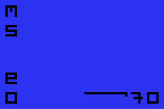
Maurizio Sacripanti. Expo Osaka ’70
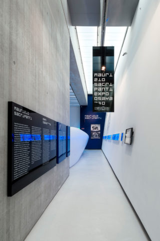
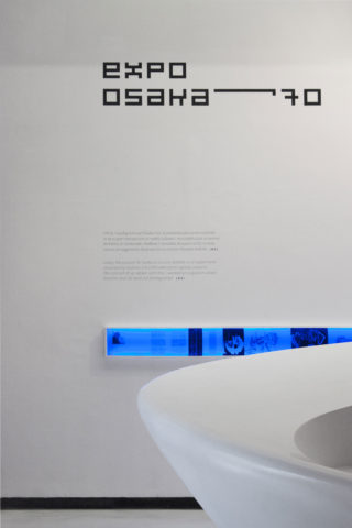
Maurizio Sacripanti was a strange and eclectic character in the panorama of Italian architecture. His way of thinking was strongly influenced by his friendships with intellectuals, artists and scientists. He was one of the most influential and interesting figure of the contemporary architecture. He designed projects like the Peugeot Skyscraper (Buenos Aires, ARG), Museo degli Eremitani (Padova, IT), Italian pavilion for Expo Osaka ’70 and many others. For the occasion of Expo Milano 2015, MAXXI — Museo nazionale delle arti del XXI secolo, decided to organize an exhibition about only one project of Maurizio Sacripanti: the Italian pavilion for Expo Osaka ’70. The exhibition, curated by Carlo Serafini and Esmeralda Valente in collaboration with Accademia Nazionale di San Luca, shows the project with drawings, photographies and a competition model. This pavilion was never realized, but is very representative in Sacripanti’s way of thinking; It includes one of the main theme that characterized the whole architect’s production: the dynamism.
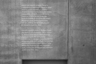
He described his project with this words: “Idea of a space in motion. Perhaps it was the memory of a Pantheon “set in motion” its dome turned into a system of poised blades, its walls into transparent membranes, or perhaps it was the memory of the hut, of the tent, perhaps,but stronger was the will to rediscover a space of time where the shattered shadow, no longer static, renders the sky elusive and habitable at the same time.” […] “Lastly, the pavilion for Osaka is not only mobility or an experiment on pulsating realities; it is a first attempt to capsize, overturn the concept of up–down: with this, I wanted an organism where function and life were not distinguished.”
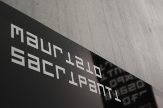
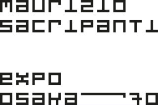
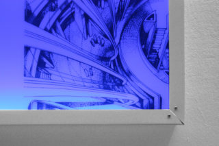
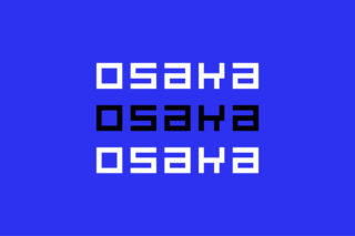
To design the identity of the exhibition Maurizio Sacripanti. Expo Osaka’70 we started from a book that Maurizio Sacripanti conceived and realized itself to narrate the project. This book is a sort of jewel, curated in every part. For this book Sacripanti used a typeface with a very strong and unusual design for that times. In this sense, we decided to digitalize and complete that typeface and to construct the whole identity on it. We used the blue color because in the Sacripanti’s projects was the color that represented the details; when he used it he transformed the architectural details in design details.