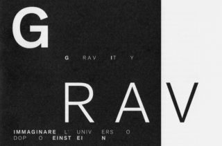
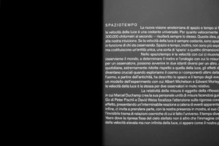
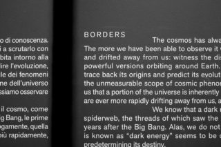
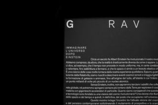
Gravity. Imaging the Universe after Einstein
Starting from the article published by Albert Einstein in 1917, the exhibition wanted to show the transformation in our conception of the universe after the theory of Relativity in which time and space, deformed and curved, has now new meanings. Not only scientists but also artists has an important role in understanding the cosmos because they approach the process as scientists do and they are both interested in the ardent desire to know. The exhibition in fact, by the use of three key concepts Spacetime, Borders, and Crisis, presented both scientific and artistic installations continuously related inside the completely black space of the gallery.
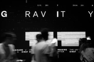
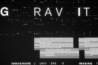
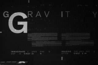
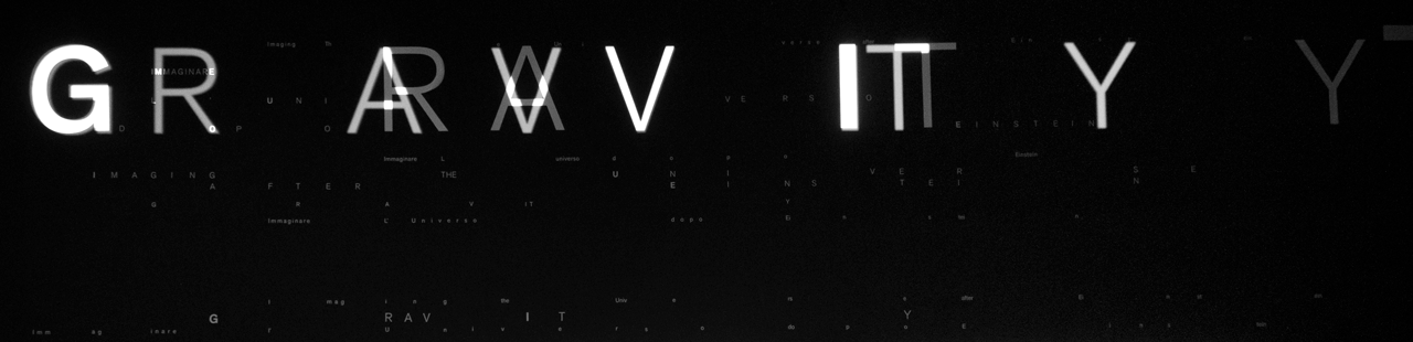
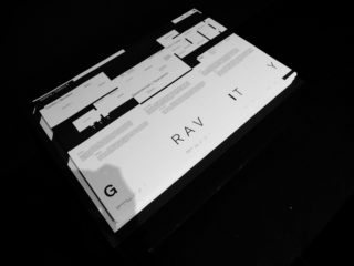
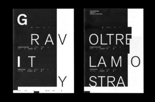
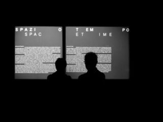
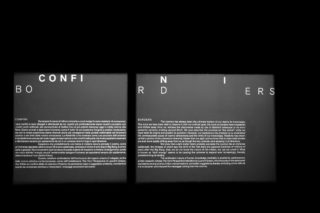
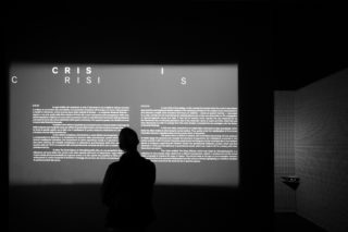
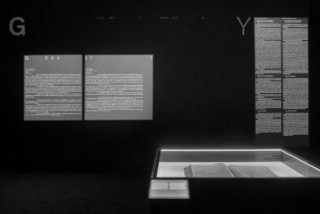
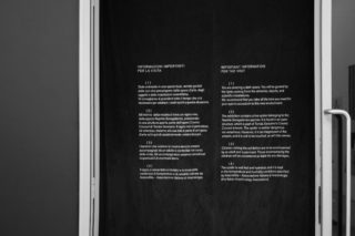
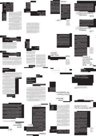
We were completely fascinate by these complex concepts so that we decided to traspose them into the graphic identity of the exhibition. To do this, we wanted to use typography, as we usually do, and arrange letters and words in a way so it seemed to be the result of the compression by a gravitational waves. We did not want to deform typography but the space where it was floating in, so that the visitor could perceive the whole of the message as the result of a movement of continuos stretching and compression.
Thanks to Rudolf Arnheim, we also knew that, as in the cosmos, separated and not aligned elements in a common space are restless and influence each other to move from tension to stillness. We also wanted to play with the concept of “mass” making visible that It does not coincide with the size of an element but is related to the density. In fact smaller object, but with a enormous mass, can curve the space-time more than a bigger one. They also influence the smaller masses. We did the same trick with the typography. We designed the texts in a way that they seemed to be always in a condition of restlessness, following the laws of the cosmos. We imagined to destroy the grid system of the typography and we hypothesized to make it flow the contents in a sort of cosmic void — but very controlled.
As the gallery would be completely dark, we chose to experiment in the opening room the great imaginative power of the light so that we lighted up each single letter with a projector that would enlighten over the pre-attached vinyls of the composition of letters, up to the smallest one. We did a similar use of light inside the exhibition defining with light the area of the texts.
Exhibition curated by Luigia Lonardelli, Vincenzo Napolano, Andrea Zanini. Scientific advice: Giovanni Amelino-Camelia. Hosted at MAXXI, from December 2017 to May 2018.